The Meaning of the Fortis Solution Logo
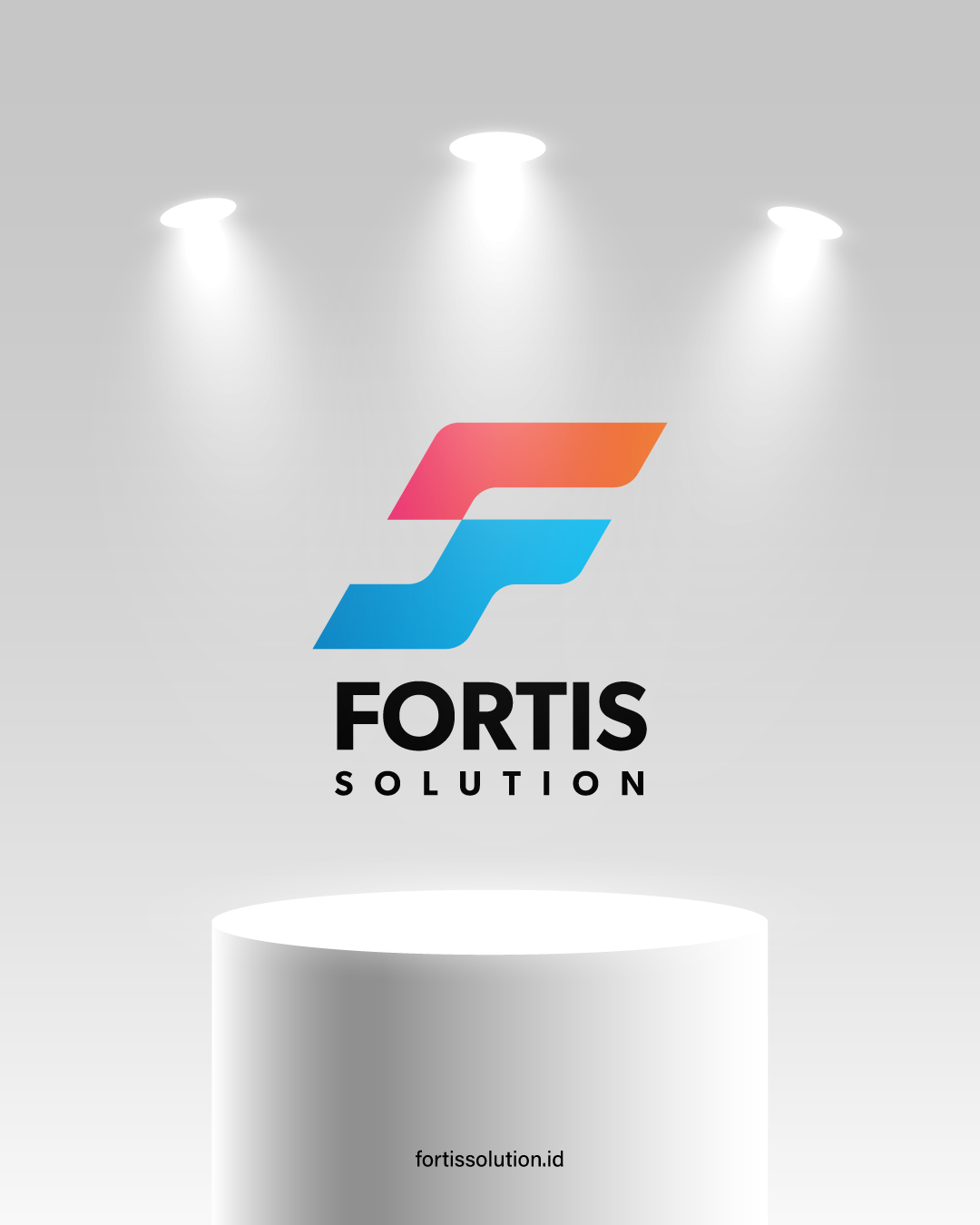
Combination of the Letters F and S
- The logo is a combination of the letters F (Fortis) and S (Solution), fused into one dynamic shape.
- This philosophy illustrates that strength (Fortis) and solution (Solution) are inseparable, mutually supportive, and the core of the company’s identity.
Italic Letter F (Forward Slant)
- The forward slant symbolizes future-oriented, progressive, and relentless movement towards progress.
- This emphasizes the company’s vision to continuously innovate and become a leading IT solutions provider in Indonesia.
Sturdy and Dynamic Shape
- The bold and angular structure demonstrates strength, reliability, and a solid foundation.
- The flowing diagonal lines convey a sense of dynamism, connectivity, and efficiency.
Red-Orange Gradient (Top)
- Symbolizes innovation, energy, courage, and a spirit of positive change.
- Demonstrates the company’s commitment to consistently providing creative solutions that are relevant to current developments.
Blue Gradient (Bottom)
- Depicts professionalism, integrity, and trustworthiness.
- Symbolizes service reliability, technological stability, and a commitment to building customer trust.
Bold Black Typography
- The word “FORTIS” in bold emphasizes strength and credibility, while “SOLUTION” in light font represents flexibility, openness, and adaptability to customer needs.

